
What is responsive web design, and why does it matter for your author website?
Did you know most people will visit your author website on their phone?
So it’s super important that your author website looks just as good on mobile as it does on desktop!
In today’s post, I explain what ‘responsive web design’ really means, and how to make sure your site looks fantastic no matter what size screen readers are viewing it on.
Why responsive web design is a good thing
We’ve all had the experience of visiting a website on our phone, only to find the text so teeny tiny it’s impossible to read, or the images too small to make sense of… Or we’ve tried to pinch and zoom in only to have the whole website slide around frustratingly underneath our fingers.
Responsive websites make sure that these things don’t happen.
A responsive, mobile-friendly author website helps you:
Make a strong first impression
Keep readers on your site for longer
Make it easy for people to find your books
Encourage newsletter sign-ups
They are critical to ensuring a good user experience and making sure people looking at your site on a mobile or iPad don’t just click off in frustration.
(Also: having a non-responsive website these days makes your site look like a proper dinosaur, and makes people think it’s unlikely to be up to date. All of this is BAD, basically.)
All Squarespace websites are responsive! 🥳
It’s one of the reasons the platform is so great – and one of the reasons I love it.
But let’s start with explaining exactly what that means…
What is responsive web design?
Responsive websites are sites that automatically ‘respond’ (ha) to the device they are being viewed on.
This means that if you look at the website on an iPhone, it will resize automatically, in order to display the content in the best possible way on the screen, making sure that it’s user friendly (easy to read and navigate) and that the person viewing the site has a good user experience.
Instead of creating separate versions of your site for desktop and mobile, a responsive website reshapes itself automatically. Text resizes, images scale, and layouts shift so everything still looks clean and easy to use.
Here’s how Squarespace explains it:
“Squarespace’s built-in responsive design resizes your content and images to fit different devices and screen widths. With responsive design, visitors can automatically view your site in many ways, so you don’t need to create and maintain separate sites for every potential device, browser, and display width”
Want me to build you a website?

My streamlined yet personal approach, perfected over the past 6 years of building websites for ambitious authors just like you, means I can create your dream author website without overwhelming you with tech jargon or confusing decisions, supporting you throughout the whole process and gently guiding you with my expertise.
Find out more, then get in touch. I would love to hear from you!
What responsive web design means for your site
This means that any content you add to your website – text, images, buttons and other elements – will automatically resize depending on the size of the screen they are being viewed on.
What this also means is that on a small laptop screen your site will look (slightly) different than on a large desktop. And it will look even more different on a mobile phone.
Sometimes when I send websites to clients for their feedback, I get comments back such as: ‘Can we make sure the title of my novel doesn’t break over two lines in the header?’ and ‘I can’t see the whole of the banner image when I look at my site on mobile – can you fix it?’
These are the limitations of responsive website design.
BUT! The upside is that on all screens the site will be attractive and easy to use.
The most noticeable example of this is the amount of space there will be around certain elements.
Here’s an example from my own author website:
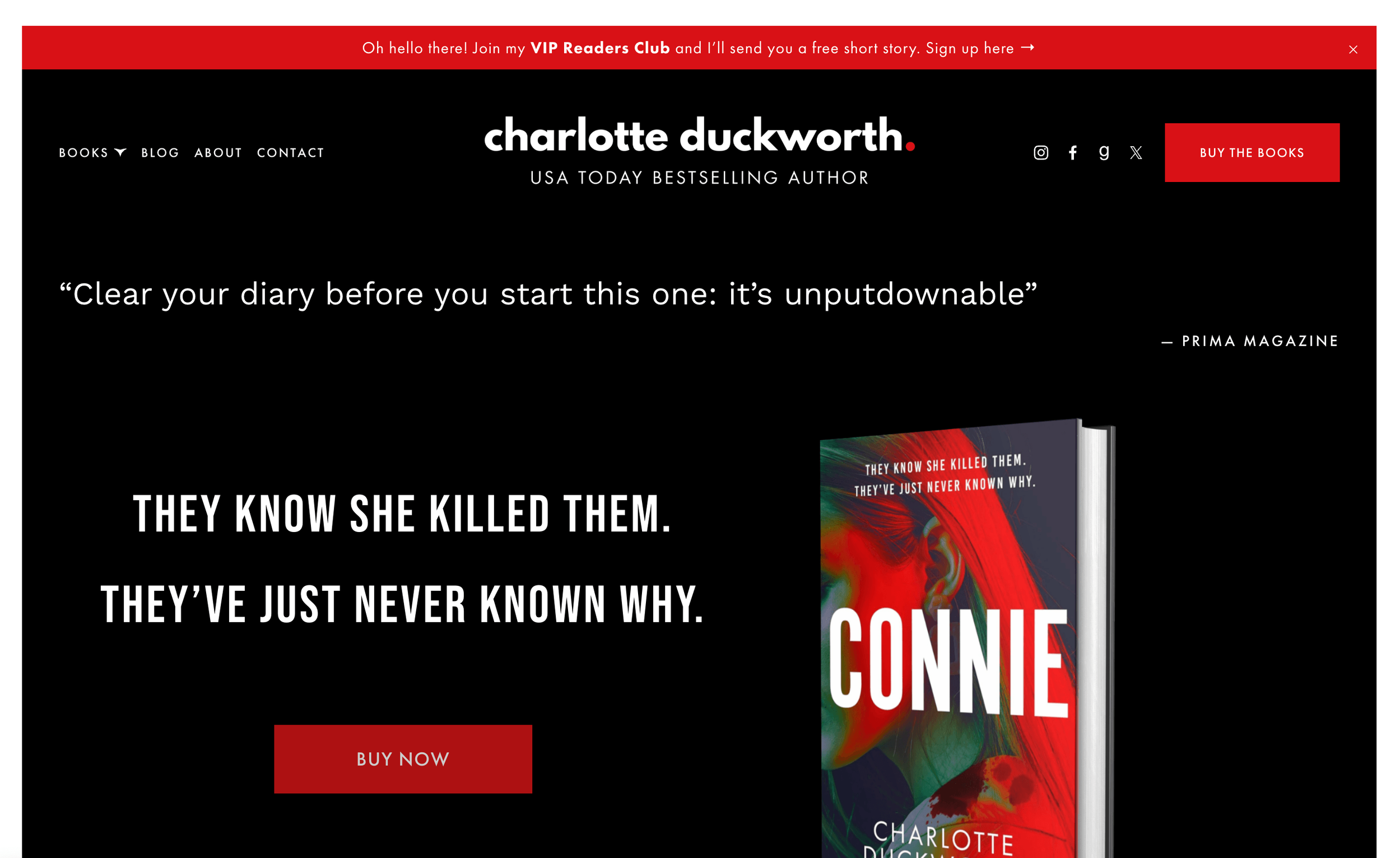
On my laptop, the banner image appears with a blurb at the top, the picture of the cover of my book on the right, and then the tagline on the left, along with the button below (my call to action encouraging users to click through to buy the book).
However, when you view my site on a mobile, you get quite a different image.
Here, you get the image of the book first, with the quote below, and the button below that.
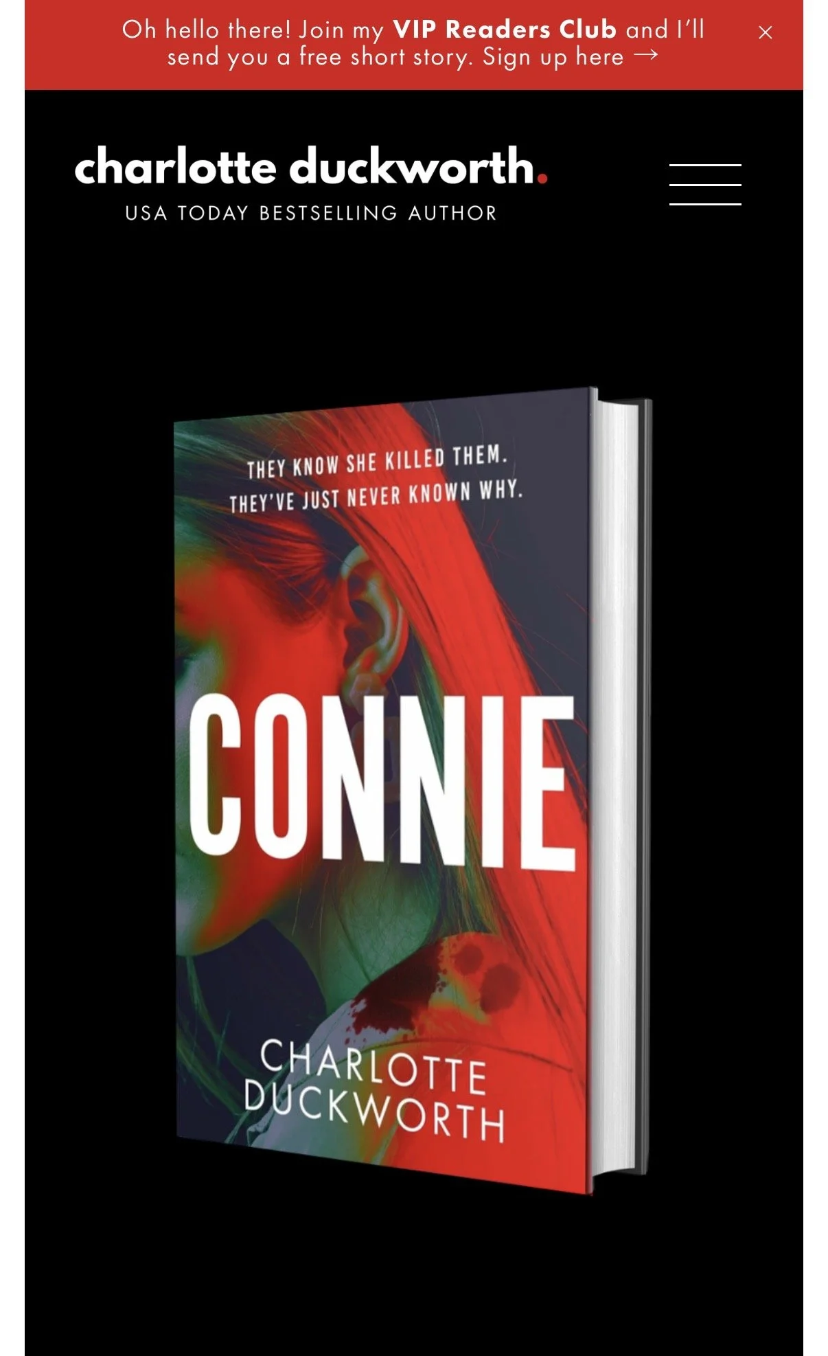
This is responsive design in action!
It means that all the important elements for my homepage banner – the book cover, the quote, and the call to action – are still easily visible on a mobile phone, and visitors to the site know what to do.
You also might find that any text on your site breaks over different lines depending on the size of the screen, as it resizes in order to make sure it’s easy for people to read.
This can be frustrating – for example if you don’t want to have the title of your book breaking over two lines, as one of my clients once asked me about – but it’s the price you have to pay in order to ensure your site looks smart on mobile, and is a much better compromise than tiny text that no one can read.
Unfortunately, you can’t just put in a paragraph return to try to force certain words onto certain lines.
If you do that, when the screen resizes and the words all move around, these breaks can look odd, leaving strange gaps.

How responsive design helps your SEO
Responsive design isn’t just about how your website looks, it also affects how it performs in search results.
One of the biggest benefits is that your text is built into the page itself, rather than embedded in images.
This means search engines like Google can actually read and understand your content, which is essential if you want your author website to show up in search results.
How to get your author website to rank on Google | SEO tips →
It’s also worth knowing that Google uses mobile-first indexing.
This means it primarily looks at the mobile version of your website when deciding how to rank it.
If your site doesn’t work well on a phone, it can directly affect your visibility.
Best practice tips for images
So how do we make sure our website looks good on all devices?
The most important thing to consider when building a responsive site (on Squarespace or another platform) are the images. And most specifically the banner or background images.
You need to choose an image that will look good on as many size screens as possible.
It also helps to choose images that are roughly the same shape as the space in which they’ll appear – for example, using a landscape (or wide) image for a banner.
However, do think carefully about your image and choose one that will still work even when cropped. Abstract patterns and images without any text, or borders, work best for banner images.
It can be tempting to design beautiful graphics with text inside them, especially for things like book blurbs or announcements.
But, as I mentioned, from an SEO point of view, this can hold you back.
Search engines can’t read text inside images in the same way they can read normal website text. So if something is important, like your book description or key information about your work, it’s always better to include it as real text on the page.
Consider the cropping
Also, bear in mind that if you use a full-width banner image of a person, it’s important that a specific area of the image (their face) isn’t cropped out.
So make sure you add a wide bleed area around all four edges of the image so that the important part of the image appears no matter what size the screen is.
This way, when it’s cropped, the their face will still appear in the centre, and won’t be cut off.
Best practice tips for text
As mentioned above, text on a responsive website resizes automatically to fit the screen. Because of this, you won’t always be able to ‘shape’ the text in the way you might like.
You can use Spacer blocks or Fluid Engine in Squarespace to add padding around text blocks, and of course you can use left, right and centre alignment so you have some control over how text appears.
More information about Fluid Engine →
As I said above, it’s best to add all text on your website directly on the page, rather than using images with text you have overlaid onto them (for example in Canva).
This will avoid cropping issues and it also means that search engines can ‘read’ the text, which helps with your SEO.
🚨 NB: Text that’s part of the actual image itself is unreadable by Google and other search engines.
How to make your author website mobile-friendly
Even with a responsive template, there are a few simple things you can do to improve the mobile experience:
Keep paragraphs short and easy to scan
Avoid putting important text inside images
Make sure your font size is large enough to read comfortably
Check spacing so nothing feels cramped
Test your site on your own phone regularly
Small tweaks like these make your site feel much more professional and easier to use.
Last but not least
When you’re working on your site, make sure you regularly check how it looks on different devices.
There are several tools you can use to do this (there are Chrome plugins that do this, and you can also use Chrome’s own built-in Developer Tools).
Squarespace also offers a very clever ‘device’ view in the back end of its system, which means as you are making changes, you can switch views to see how they are reflected on mobile.
You can find out more about this here →
But a foolproof way to make sure your site looks good on mobile is to keep your mobile phone close to hand and regularly refresh your website on your mobile phone browser so that you can see how it’s all looking.
Save 10% off your first year’s Squarespace subscription using code CHARLOTTE10
FAQs about responsive author websites
What does “mobile-friendly” actually mean for an author website?
A mobile-friendly author website is one that’s easy to read and use on a phone. That means text is large enough to read without zooming in, buttons are easy to tap, and pages load quickly.
It should feel just as simple to browse your books or sign up to your newsletter on a phone as it does on a laptop.
Do I need a separate mobile version of my website?
No, not if your website is responsive.
Responsive web design means your site automatically adapts to different screen sizes, so you don’t need to create a separate mobile version. Most modern platforms, including Squarespace, handle this for you.
How do I check if my author website is responsive?
The easiest way is to open your website on your phone and have a proper look around.
Check that:
the text is easy to read
nothing is cut off
images resize properly
buttons are easy to tap
You can also resize your browser window on desktop to see how your layout adjusts.
Does responsive design really affect SEO?
Yes, it does.
Google prioritises mobile-friendly websites, and if your site is difficult to use on a phone, it can impact your rankings. Responsive design also ensures your text is readable by search engines, which helps them understand what your site is about.
If you want to improve this further, my post How to get your author website to rank on Google | SEO tips goes into more detail →
What’s the biggest mistake authors make with mobile design?
One of the most common issues is putting too much information into images instead of using real text.
It might look nice visually, but it can make your site harder to read on smaller screens and limits what search engines can understand.
Can I fix mobile issues on my existing website?
In most cases, yes.
If you’re using a platform like Squarespace, your site is already responsive, so it’s usually a case of improving layout, spacing, and content rather than starting from scratch.
If you’re unsure where to begin check out my 5 expert tips for your DIY author website →
More posts like this: